Inspired by an artist friend, I wanted to keep a visual journal. The intention was to make one sketch or doodle everyday. Keeping up the habit was not easy, but what was harder was coming up with interesting subject matters. Most of mine turned out to be food or food related, as you can see...
This piece is called “Cute Factory”. At the time, I had a client that was a sticker company. They hired me to design scrapbooks and scrapbooking related accessories. Their office was located in an industrial building in the suburbs... basically a factory cranking out all these cute and pretty things. I thought it was kind of ironic and this idea stuck with me. Later I used these graphics to make some silkscreen prints. The actual characters in the illustration have nothing to do with the sticker company. These sprang from things my dog loves to eat... which is pretty much everything.
Here are some of the scrapbook design concepts I mentioned above. These were eventually put into mass production. The client was open to all suggestions, which kind of shocked me at first. Once over the initial shock, it was a lot of fun coming up with ideas incorporating 3D objects and tactile finishes. My love for bookbinding really came in handy. For instance, buttons on the blue book were eventually produced and the lines on from the colour pencils on the green book were real threads stitched on a fabric wrapped cover.
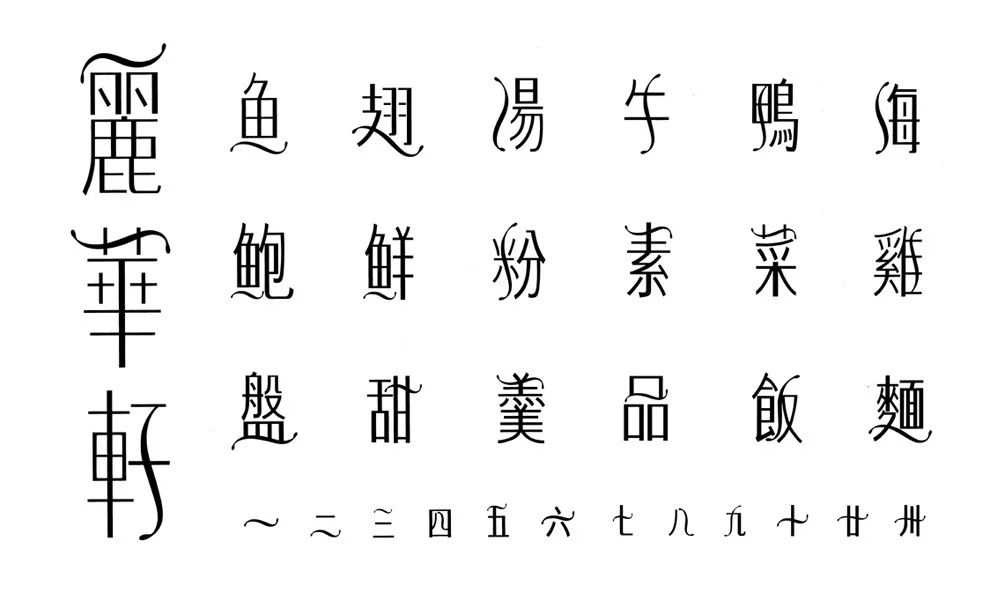
Lai Wah Display is a series of Chinese characters designed to function as display caps for the collateral needs. This project originated with the client Lai Wah Heen, an upscale Chinese restaurant needing a Chinese word mark (the larger characters on the left.) The styling and aesthetics evolved into the concept of creating some unique characters. Started out as a typography experiment, but eventually the results flourished into applications in ad campaigns and various promotional material. It even won an Applied Arts design award.


